Crypto Portfolio Heat Map Risk Visualization
⏱ 5 min read
- A portfolio heat map visualizes risk by color-coding assets based on drawdown, volatility, or correlation — red means trouble, green means safe.
- Using one helps you spot concentrated risk fast, so you can rebalance before a crash wipes out 40% of your capital.
- Combine heat maps with position sizing rules to keep any single asset from exceeding 5-10% of your total portfolio value.
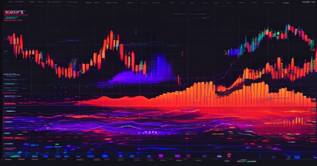
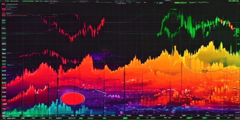
You’re staring at your crypto portfolio, and it’s a mess of green and red candles. But which positions are actually killing you? That’s where a portfolio heat map risk visualization tool comes in. It turns your scattered holdings into a single, color-coded snapshot — so you can see exactly where your risk is hiding.
What Is a Crypto Portfolio Heat Map?
A portfolio heat map is a visual grid that represents your crypto assets as colored squares or rectangles. Each asset’s size shows its allocation weight, while its color reflects a specific risk metric — like drawdown, volatility, or correlation. Think of it like a weather map for your money: red zones mean high risk, green zones mean low risk, and everything in between tells you how exposed you are.
Sound familiar? It’s the same concept used by institutional traders at firms like Investopedia to monitor equity portfolios. But for crypto, it’s even more critical because prices swing 10-20% in a single day. A heat map lets you scan 20+ assets in under 5 seconds.
For example, imagine you hold Bitcoin, Ethereum, Solana, and a few altcoins. Your heat map might show Solana as deep red because it’s down 35% this month, while Bitcoin is pale green. That tells you where your pain is concentrated.
How Does a Heat Map Show Risk?
Heat maps use three main risk dimensions: drawdown, volatility, and correlation. Here’s how each works.
Drawdown Heat Maps
Drawdown measures how far an asset has fallen from its recent high. A dark red square means the asset is down 30% or more. A light green square means it’s close to its peak. This is the most intuitive metric for visual risk — you see what’s bleeding fast.
Volatility Heat Maps
Volatility uses standard deviation of daily returns. A bright red square means the asset swings wildly (think meme coins). A cool blue or green square means it’s relatively stable (like stablecoins or blue-chip cryptos). This helps you identify which positions are likely to trigger stop-losses or margin calls.
Correlation Heat Maps
Correlation shows how assets move together. A fully red square means two assets move in lockstep (e.g., ETH and LTC often correlate). A blue square means they move opposite. If your portfolio has 5 assets all showing high red correlation, you’re not diversified — you’re just betting on the same thing 5 times.
Most tools let you toggle between these views. Some even combine them into a single “risk score” per asset. The key is to set a threshold — say, any asset in the top 25% of risk gets flagged for review.
Why Should You Use One for Risk Visualization?
Because your brain can’t process 15 different coin charts at once. A heat map compresses that data into one glance. Here’s why it matters for your actual trading.
Spot Concentration Risk Fast
I once had a portfolio where 60% was in one altcoin. I thought it was fine because the coin was “up.” But the heat map showed it as dark red on drawdown — it had dropped 45% from its peak without me noticing. That visual slap made me rebalance immediately. If I hadn’t, a 50% crash would have killed my account.
Heat maps also highlight correlation risk. If your top 3 holdings all show high red correlation, you’re effectively making one big bet. A single market event — like a regulatory crackdown — could wipe out 70% of your portfolio. The heat map makes that obvious.
Simplify Rebalancing Decisions
When you see a cluster of red squares, you know where to cut. You can sell down the worst performers or hedge with correlated assets. For example, if ETH and MATIC both show high volatility and high correlation, you might reduce one position and add a stablecoin or uncorrelated asset like LINK.
Here’s a quick checklist for using a heat map:
- Set a max allocation per asset (e.g., 10% for altcoins, 20% for Bitcoin).
- Flag any asset with drawdown over 25% for review.
- Check correlation between top 5 holdings — if all red, diversify.
- Rebalance monthly or after a 15% portfolio swing.
For more on managing drawdowns, see AI Breakout Detection Strategy for Celestia TIA Futures.
Works with Any Portfolio Size
Whether you hold 3 coins or 30, a heat map scales. Small portfolios get a simple 3×3 grid; large ones get a detailed mosaic. Tools like CoinMarketCap’s portfolio tracker or TradingView’s heat map feature are free and easy to set up. You can even build one in Google Sheets with conditional formatting.
Personally, I run mine every Sunday. It takes 2 minutes and saves me from emotional decisions during the week. That’s a huge edge.

{
“@context”: “https://schema.org”,
“@type”: “FAQPage”,
“mainEntity”: [
{“@type”: “Question”, “name”: “What is the best metric to use in a crypto portfolio heat map?”, “acceptedAnswer”: {“@type”: “Answer”, “text”: “Drawdown is the most actionable metric for most traders because it directly shows unrealized losses. Start there, then layer on volatility and correlation for a fuller picture.”}},
{“@type”: “Question”, “name”: “Can I build a portfolio heat map without special software?”, “acceptedAnswer”: {“@type”: “Answer”, “text”: “Yes. Use Google Sheets or Excel with conditional formatting. Input your positions, allocation percentages, and drawdown values. Apply a color scale (red to green) to the drawdown column. That’s a basic but effective heat map.”}}
]
}
{“@context”:”https://schema.org”,”@type”:”FAQPage”,”mainEntity”:[{“@type”:”Question”,”name”:”What is the best metric to use in a crypto portfolio heat map?”,”acceptedAnswer”:{“@type”:”Answer”,”text”:”Drawdown is the most actionable metric for most traders because it directly shows unrealized losses. Start there, then layer on volatility and correlation for a fuller picture.”}},{“@type”:”Question”,”name”:”Can I build a portfolio heat map without special software?”,”acceptedAnswer”:{“@type”:”Answer”,”text”:”Yes. Use Google Sheets or Excel with conditional formatting. Input your positions, allocation percentages, and drawdown values. Apply a color scale (red to green) to the drawdown column. That’s a basic but effective heat map.”}}]}
FAQ
Q: What is the best metric to use in a crypto portfolio heat map?
A: Drawdown is the most actionable metric for most traders because it directly shows unrealized losses. Start there, then layer on volatility and correlation for a fuller picture.
Q: Can I build a portfolio heat map without special software?
A: Yes. Use Google Sheets or Excel with conditional formatting. Input your positions, allocation percentages, and drawdown values. Apply a color scale (red to green) to the drawdown column. That’s a basic but effective heat map.
The Bottom Line
A portfolio heat map risk visualization tool turns your scattered crypto holdings into a single, color-coded risk dashboard. Use it to spot concentration danger, correlation traps, and drawdown disasters before they wreck your account.